Brand Strategy
Logo Design
Visual Identity
Brand Identity
Web Design
Web Development
Financon is a company providing financial consulting and accounting services to small and medium-sized businesses. They needed a cohesive brand identity and a professional online presence to reflect their expertise, build trust, and make their services easy to discover. Our work provided a clear, approachable visual identity and a simple one-page website that communicates the brand’s core values of clarity, reliability, and ease.
Problem statement: Accounting services often come across as complex, rigid, and stressful — both in how they’re communicated and visually presented. Through our research, we discovered that Financon’s target audience is typically made up of busy individuals who juggle multiple roles within their company. Their days are filled with complex decisions and constant pressure. Financon’s goal is to ease that burden and become a trusted partner in their day-to-day.
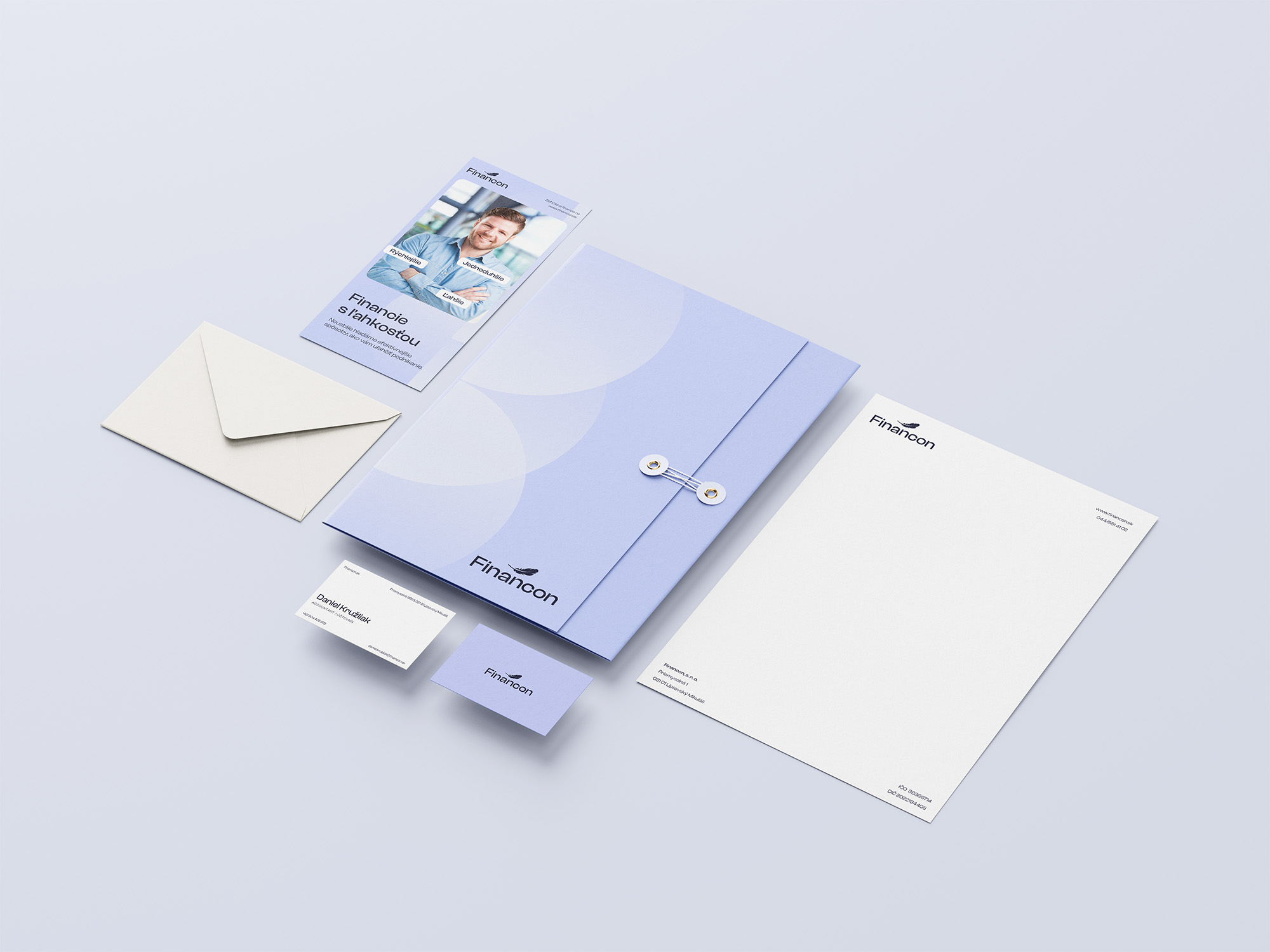
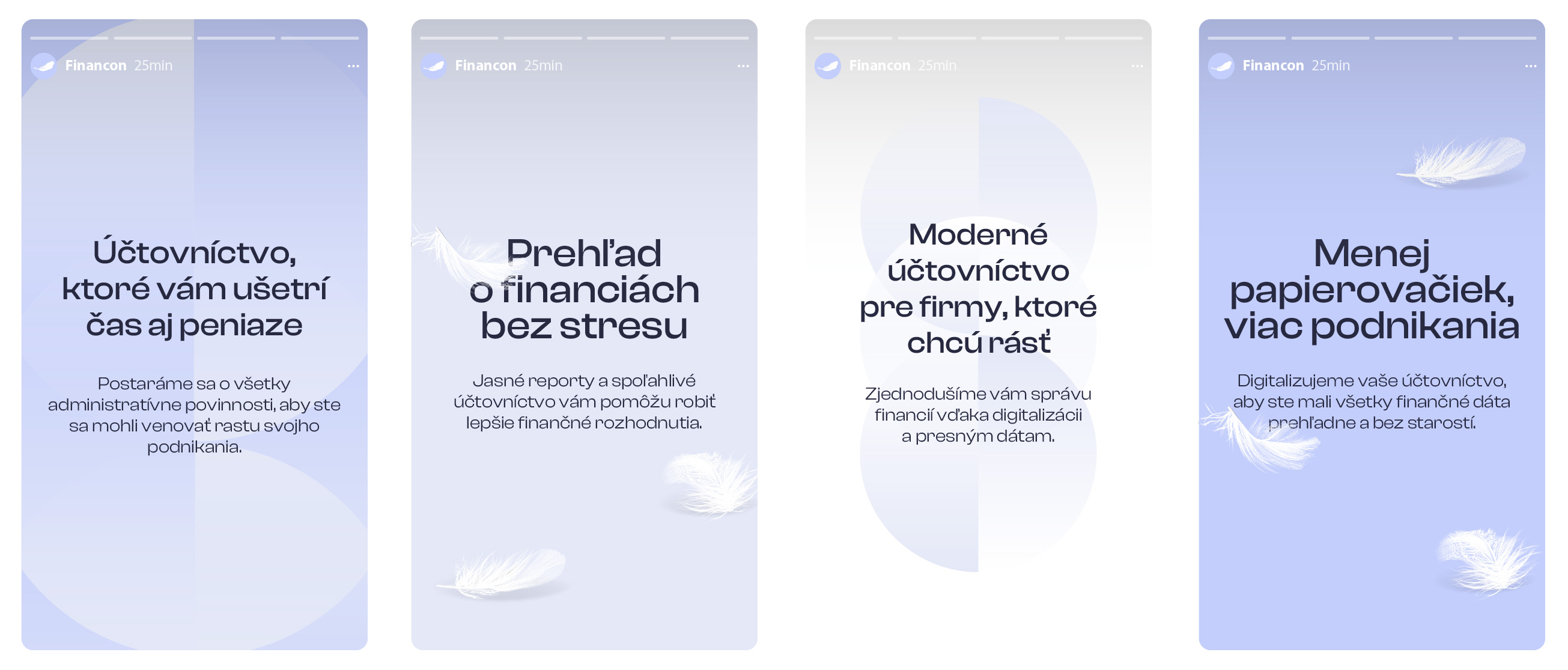
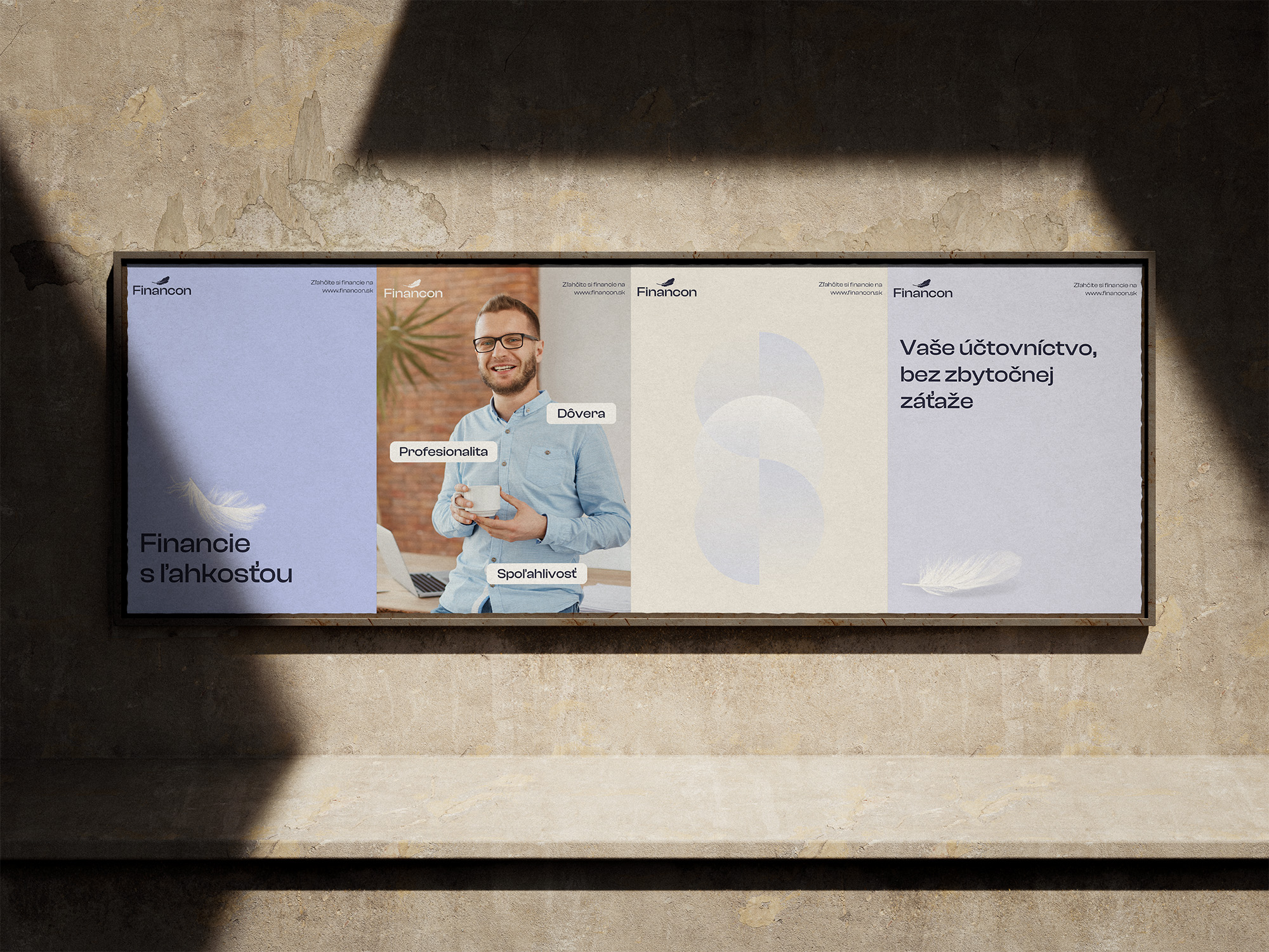
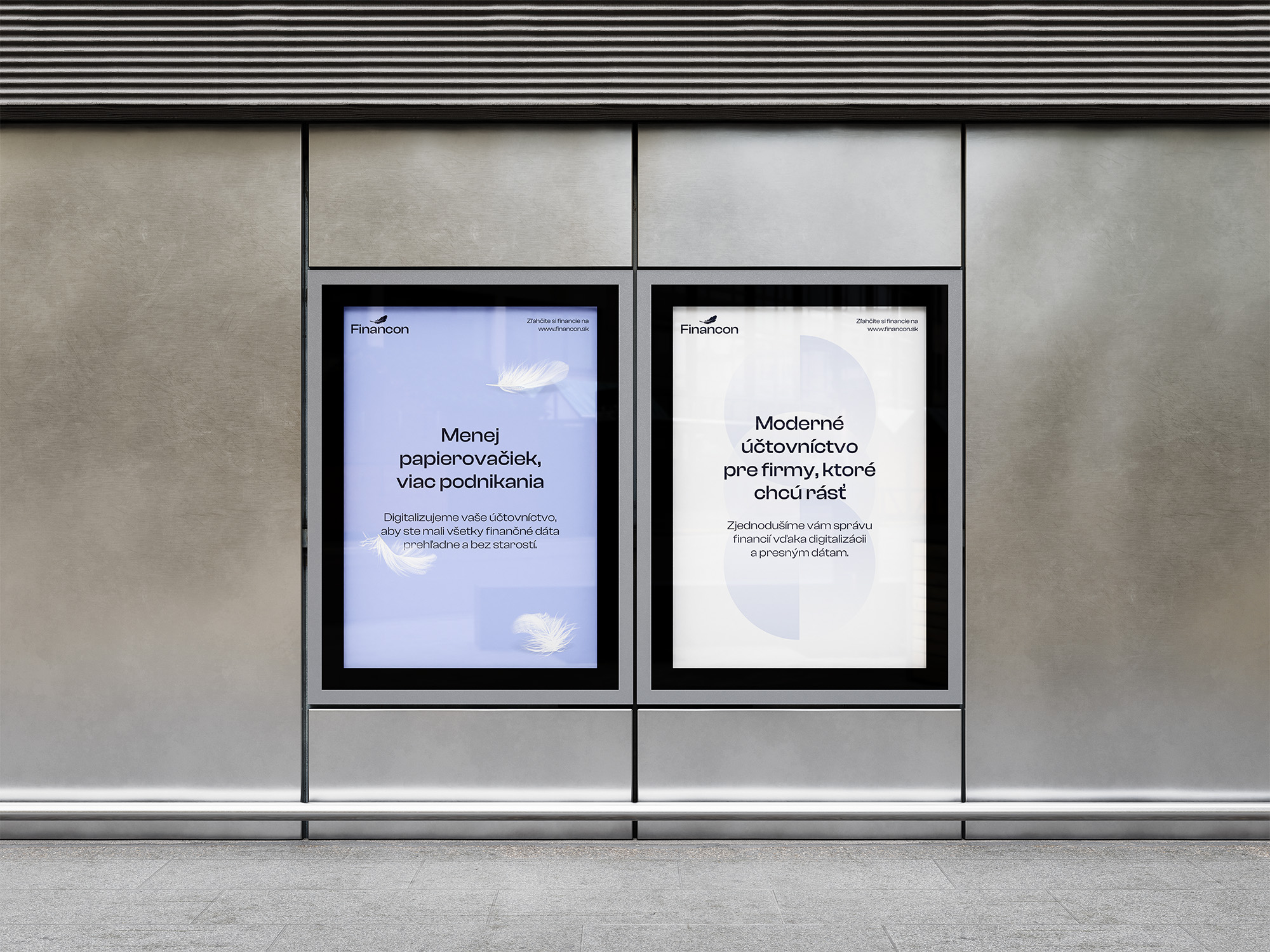
Solution: We built a brand identity around the idea of “Finances with ease,” designed specifically to respond to this insight. A light, minimal visual language combined with a soft feather motif creates an experience that feels clear, calming, and approachable.
We’re truly honored to be featured on the Best Designs Page by DesignRush. This recognition means a lot to us and reflects the care and creativity we put into our work.
Financon
Logo, Brand Identity, Brand Guidelines, Design Examples, Website
Sage + Magician = Financon
We are a Sage in traditional accounting services and a Magician who is transforming the way companies manage their finances through digitalization and innovation.
The brand voice is professional and trustworthy, reflecting our expertise in accounting. At the same time, it is accessible and clear, as our services are designed to be understandable even for those who do not deal with financial processes on a daily basis.
To become the leading provider of modern accounting and economic services in Slovakia.
Our mission is to be a trusted partner that helps our clients grow, streamline their processes, and bring clarity and order to their financial management.

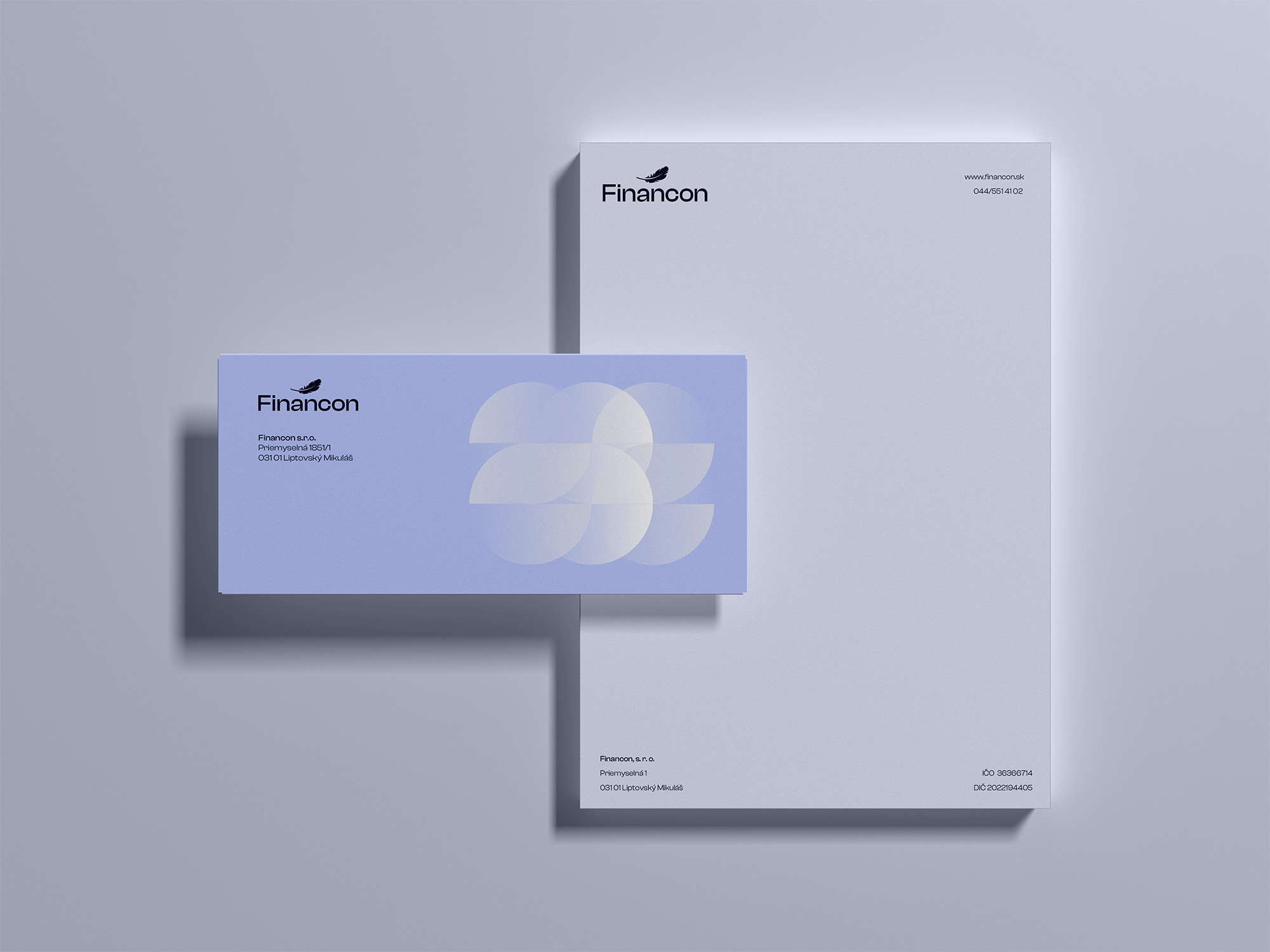
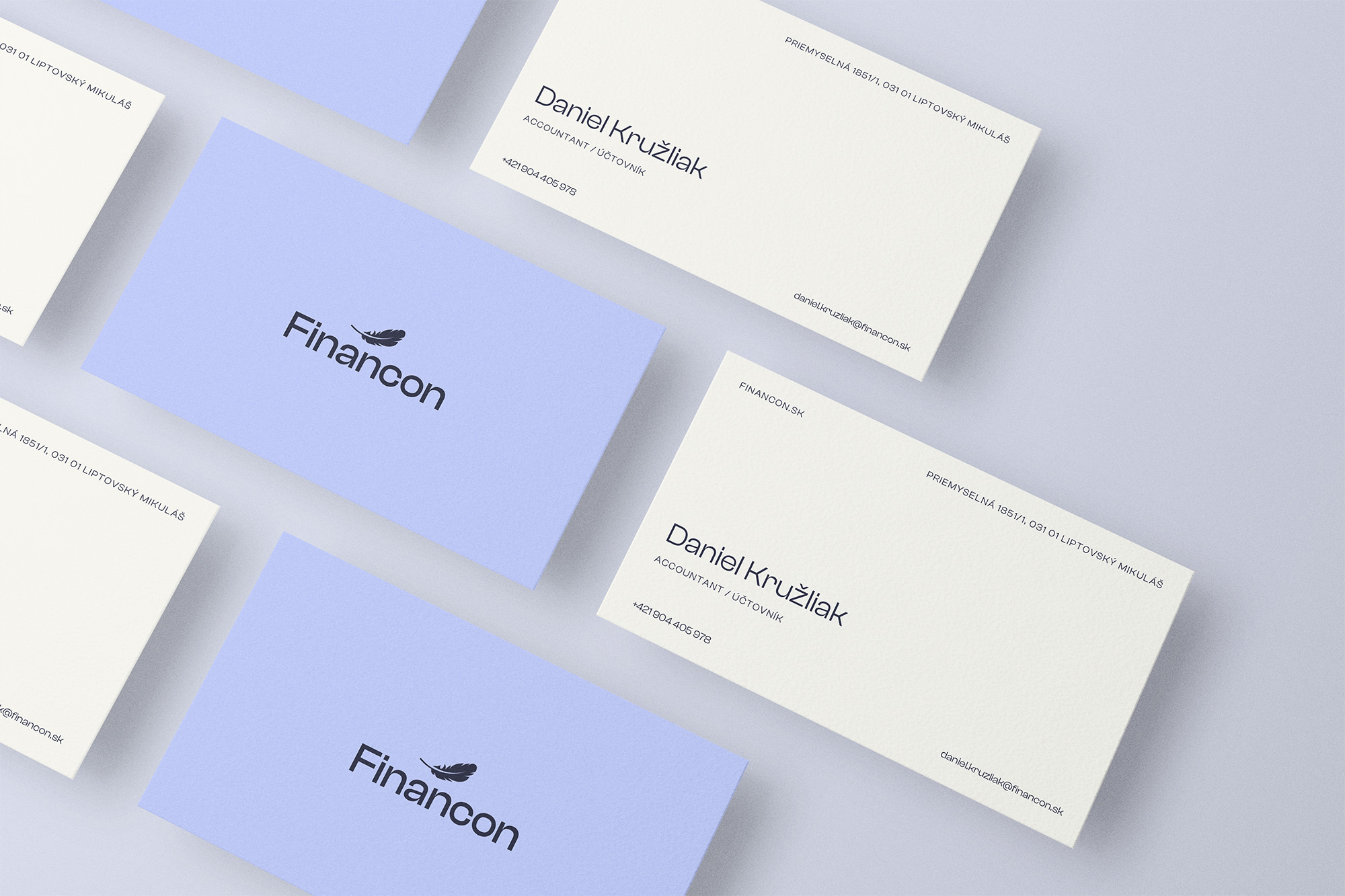
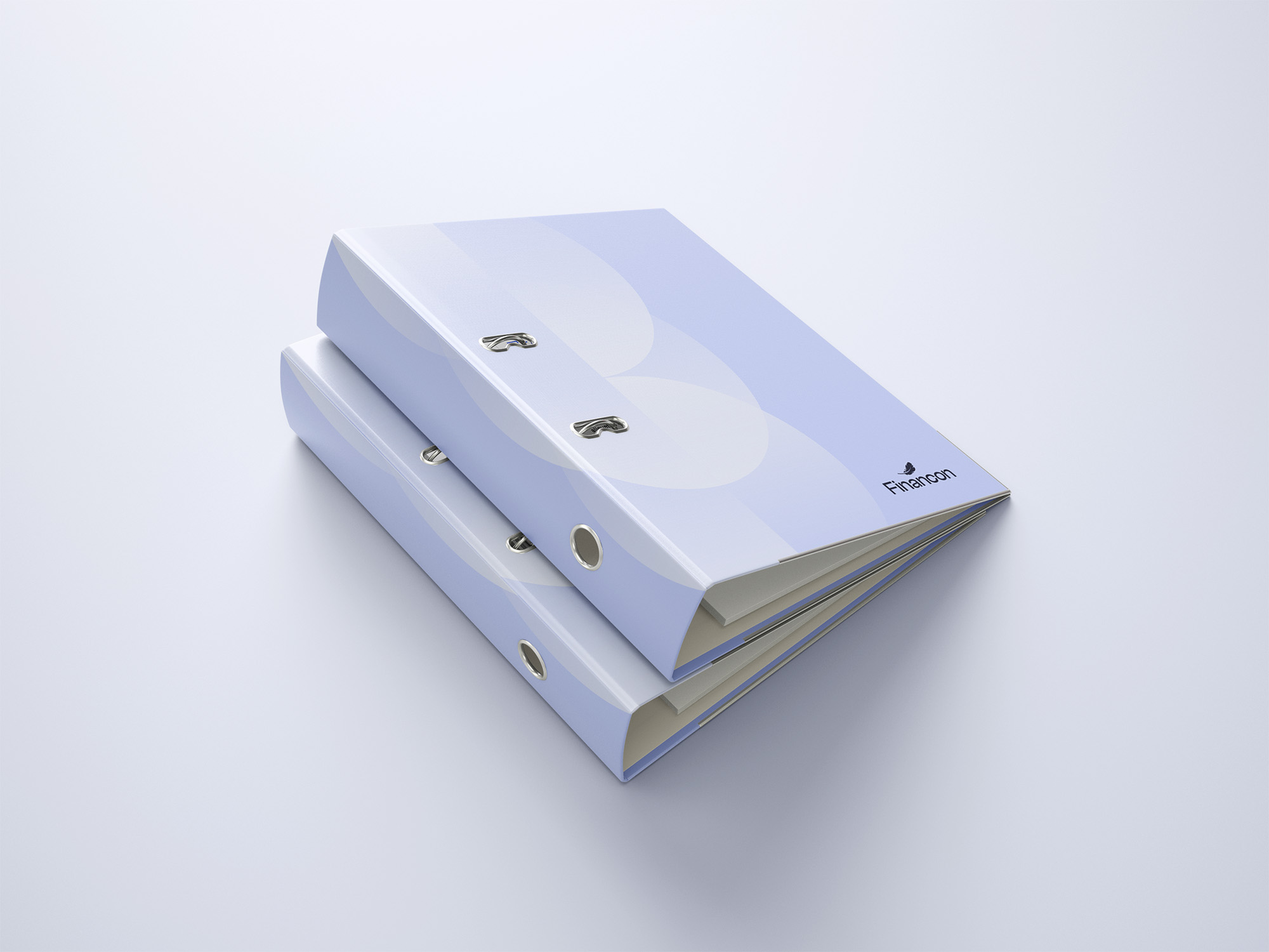
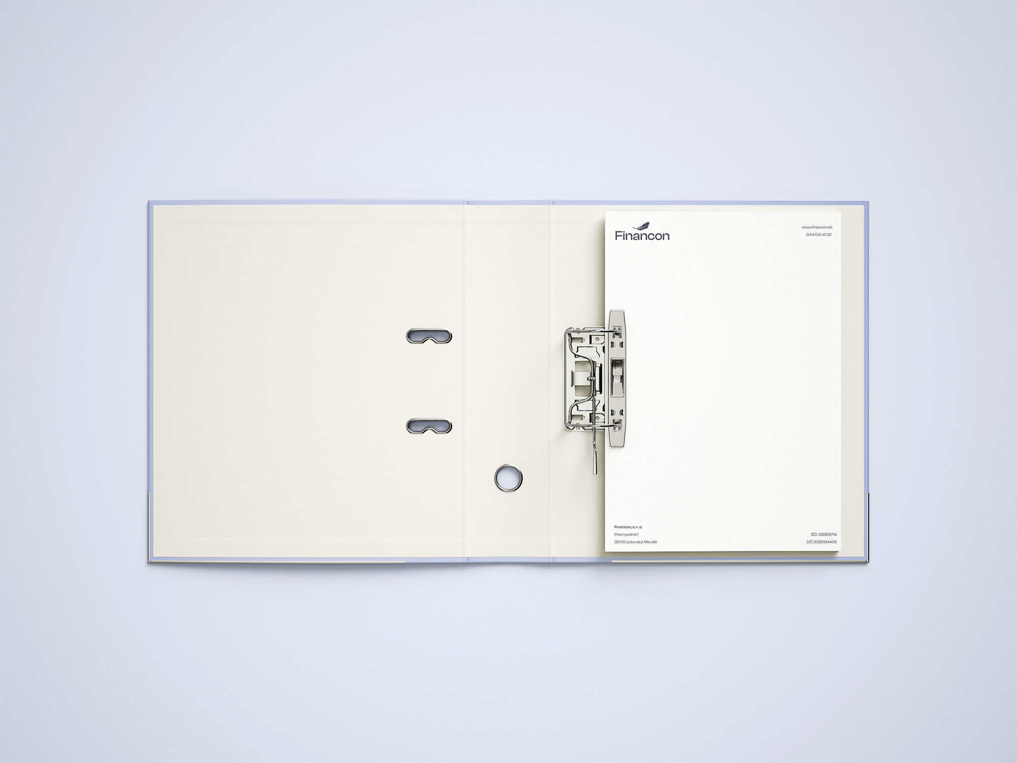
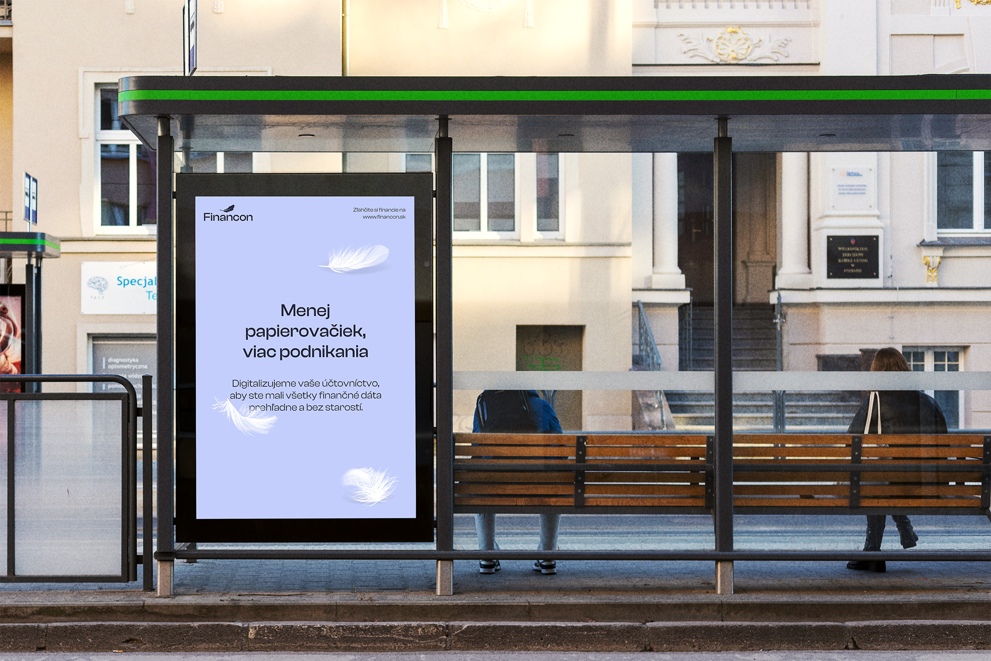
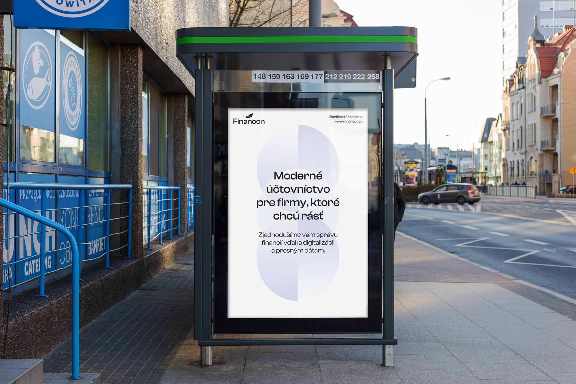
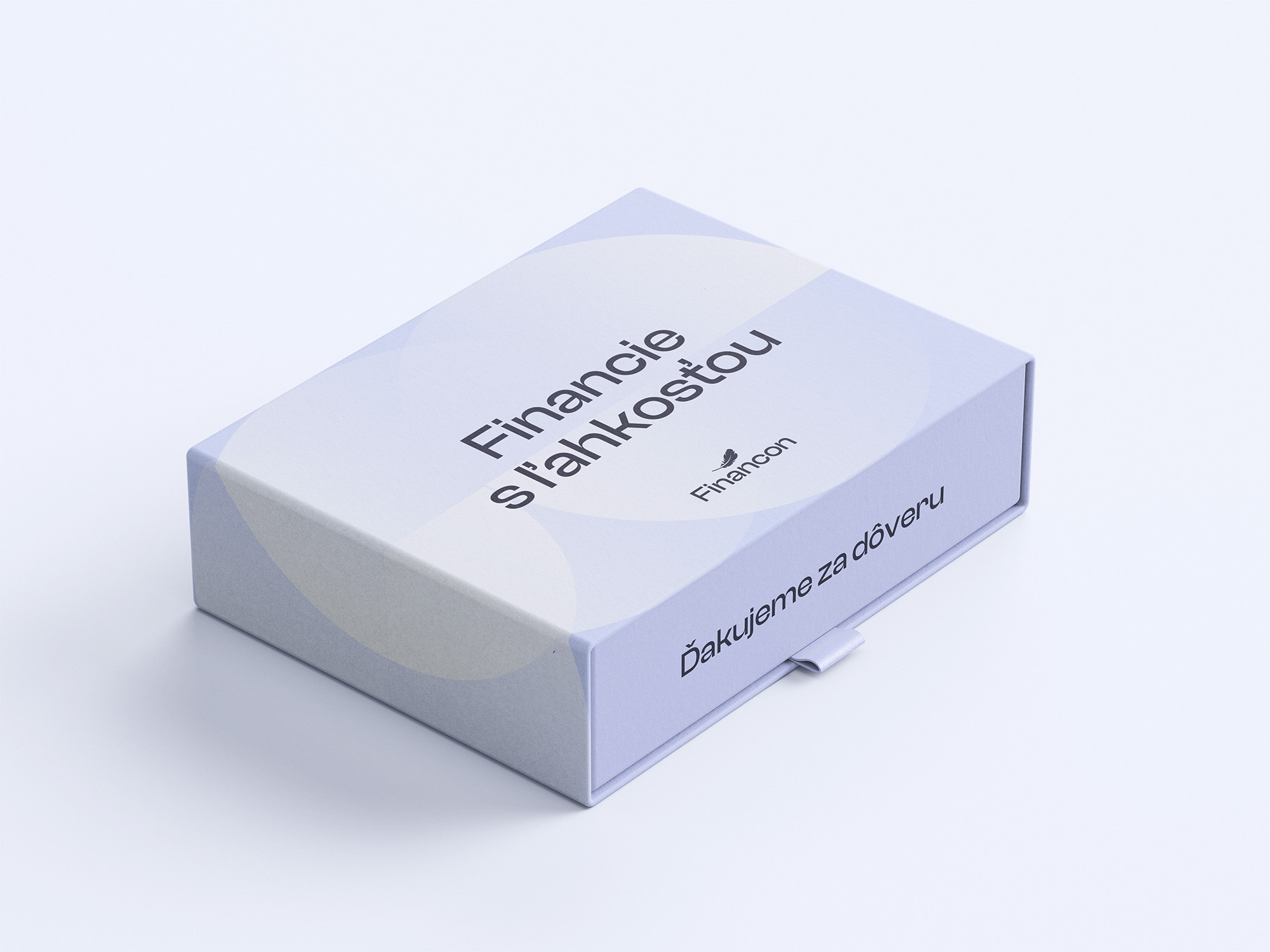
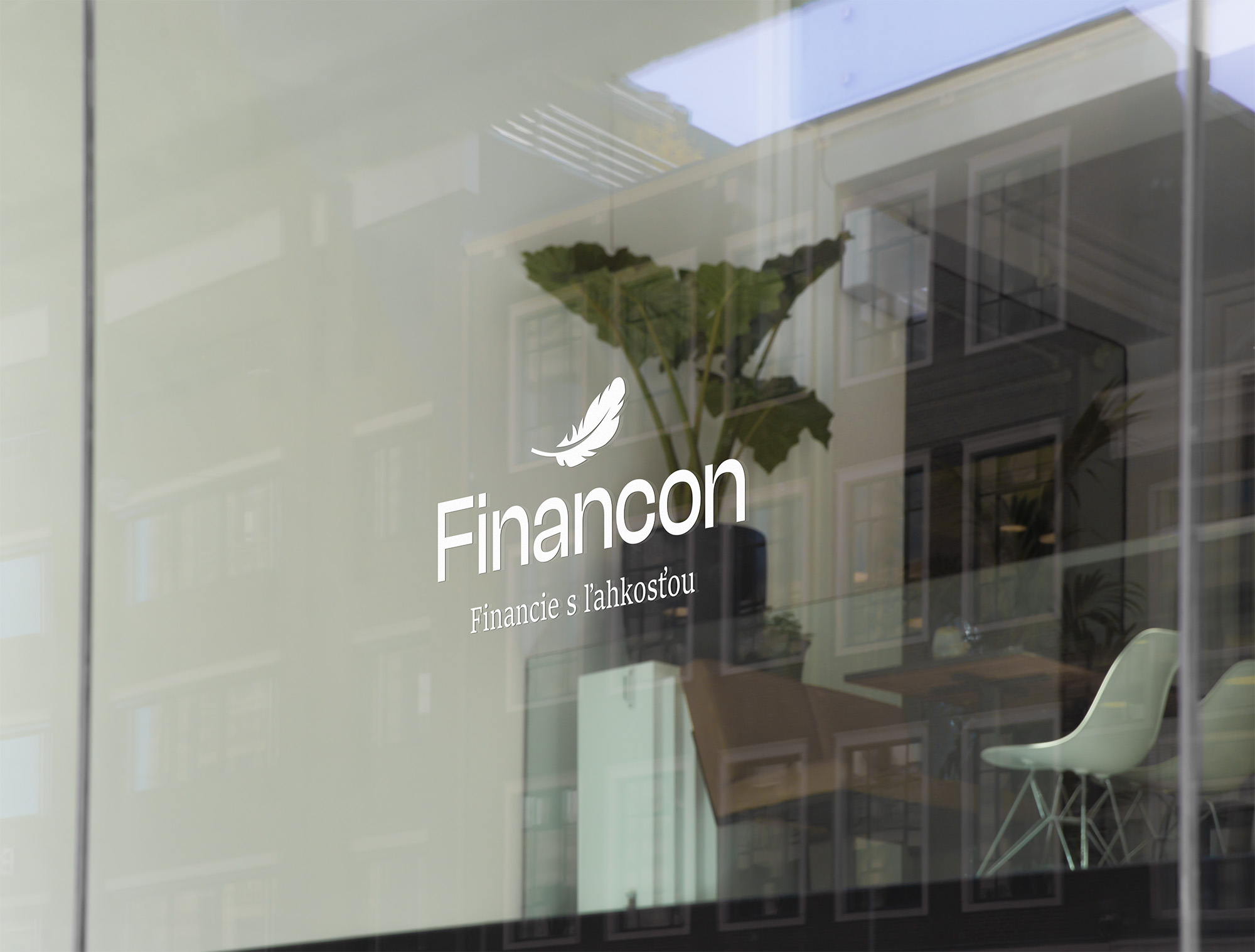
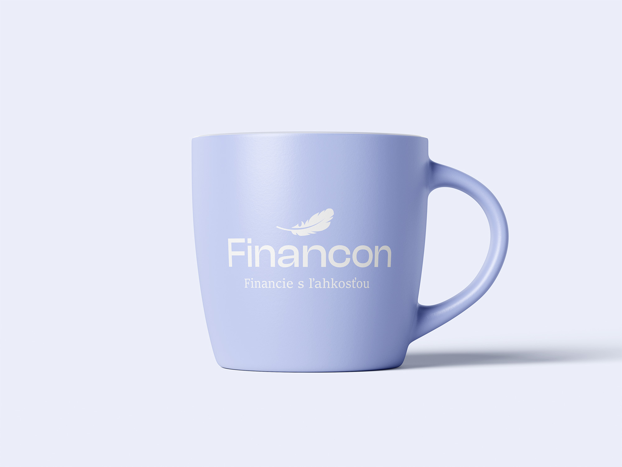
The Financon logo features a feather – a symbol of lightness and ease – paired with elegant, modern typography. It reflects the brand’s mission to simplify finance and bring clarity with a calm, trustworthy presence.
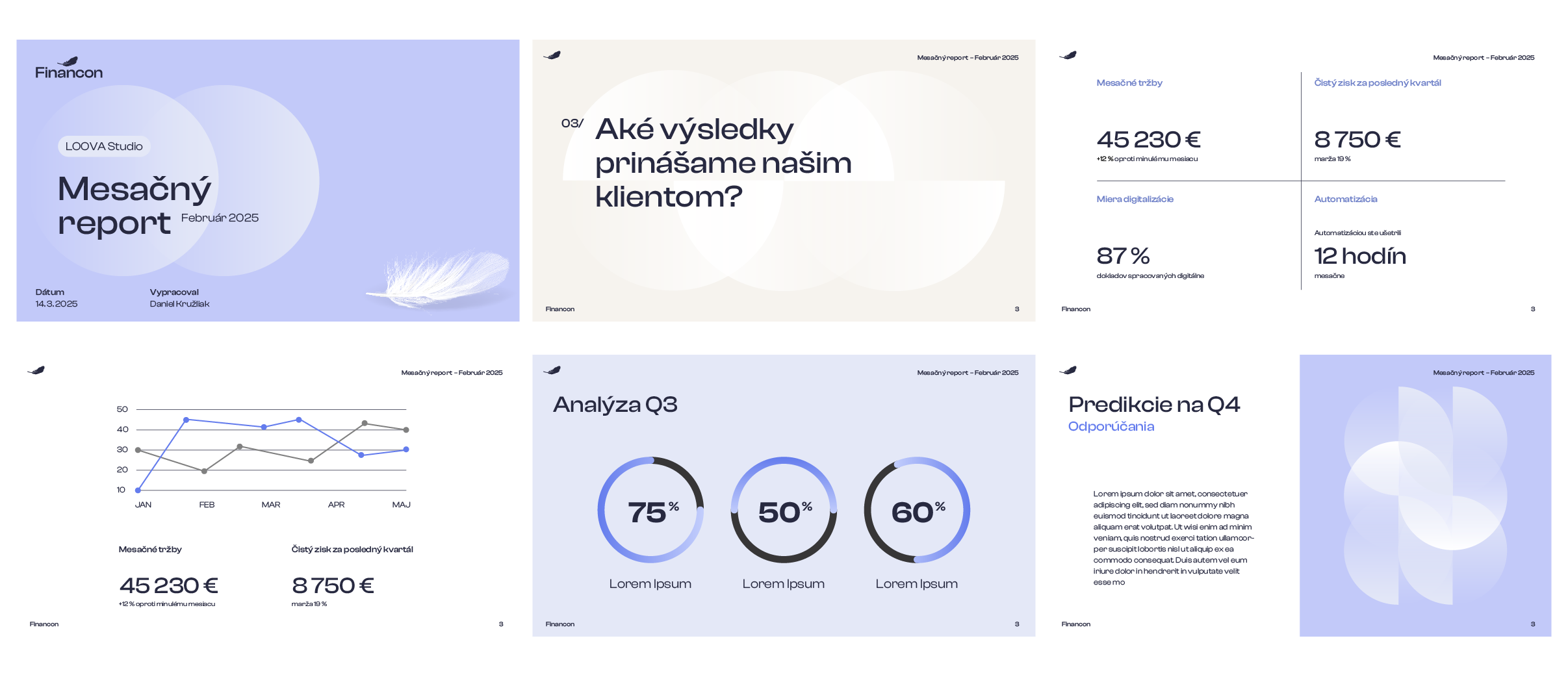
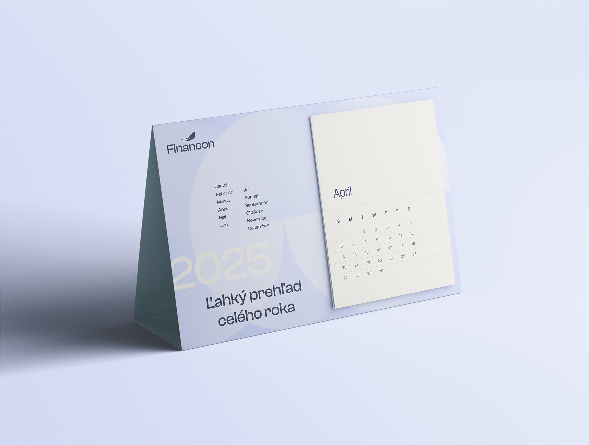
The color palette is designed to visually support a sense of lightness, calmness, and reliability.
The primary light blue symbolizes professionalism, purity, and trust, while also being calming and open.
The secondary colors – beige and white – add airiness, softness, and warmth to the design, supporting a sense of clarity and simplicity. Dark blue is used exclusively for texts.
Together, these colors create a harmonious, elegant, and modern visual expression of the brand, reflecting the concept of “Finances Made Easy.”

We use the modern and elegant Clash Display for all texts.
The key brand element is the feather, which visually personifies lightness, simplicity and relief from administration.

The background of the visual identity is a set of halved circles, representing a minimalist symbol of a feather. To soften the shapes and support the overall brand concept, we use subtle transitions and gradients, which give the design a lightness and airiness.


The visual identity of the Financon brand is not primarily dependent on photographs and can work effectively without them. However, if we use photographs, we prefer images of people in a semi-formal environment. The photographs should be bright, with the possible use of light blue elements that match the overall visual identity.
_compressed.jpg)